Workshop: Chroma
- elle walker

- Dec 20, 2018
- 1 min read
Updated: Jan 16, 2019
I really love Ben Thomas's Chroma work, which makes me think of 1950s Americana, funfairs and the colour palette in Edward Scissorhands. Whilst I was busy procrastinating, I followed the easiest tutorial I could find and had a go, to see if I could turn a dull photograph into something much more dynamic.
In Lightroom, it's a case of adjusting the tone and colours via the HSL panel and also in the camera calibration panel. By over exaggerating the blue, red, yellow and orange the candy-factor can be increased dramatically.

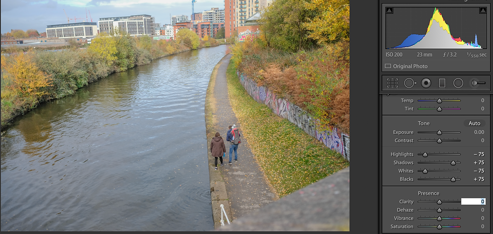


The final step is to adjust the white balance as desired.
I attempted this on a portrait but the outcome was far less successful. The rich yellowy-pink tones don't work on skin, producing an almost comic-book effect.

I am quite partial to the effect, though, so applied the process to other photographs.


This is an effect where subtlety is not required.

I've shown this version with a person cropped out, as the skin was an almost lobster shade of pink.
This style of editing could be used to create a picture-postcard effect.


Comments