FMP: Evaluation
- elle walker

- Jun 11, 2020
- 10 min read
Updated: Mar 4, 2021
Concept
The concept of 14:00 was borne out of a need to conduct a project that could be completed at home due to the COVID-19 pandemic. I had already spent a month researching potential other projects, so at the point where another idea was required, although it was my fourth choice, I was determined that I did not want the project to look like a fourth choice.
The concept was to produce diaristic photography, using the pandemic as the keystone in the idea: how would day-to-day life look under the pandemic and how could this be visualised in a manner that would resonate with my audience?
Planning
The vernacular photography of Stephen Shore, Masahisa Fukase’s diaristic photography and Anton Kusters’ repetitive photography were all influences for 14:00. I had decided to shoot a single photograph in my living room at 2 pm every day, from the same spot, to create a gallery of vernacular images. In order to ensure the photographs were taken from exactly the same vantage point and angle, I would use a tripod and place marks on the floor to place the tripod in the same spot each day. My planner was based on a test shooting and editing schedule between 6 – 8 April with feedback to be requested on 9 April. The actual schedule would run between 13 April and 12 May, which allowed plenty of time to create the photobook, request feedback and complete the evaluation.
Beyond knowing that I wanted a desaturated appearance in the images, I was uncertain as to how exactly I wanted the images to look so I explored several post-processing options and requested feedback. I took a few photographs and created six different processing options, then requested feedback.


The comments regarding Tests 4 and 5 were to be expected as the grain and vignette were slightly exaggerated for effect, to ascertain what would not look great. I rarely add a vignette and never add grain to my images, but I felt compelled to at least test them on this occasion. I was pleasantly surprised with how effective the addition of the grain in Test 6 creates visual as well as metaphorical texture to the image.
The general consensus is that Test 6 is the preferred option. Regarding the composition, though Test 6 gives more of a sense of space, the tight crop in Test 1 represents the claustrophobic, intense feeling of life under lockdown.
In response to Dan’s feedback (the final piece of feedback), I took a further two photographs to examine what effect the size of the image has on the narrative and also how it would affect my post-processing options. The image size was set in camera, again, to ensure consistency with the dimensions and the size of the image file.


I opted for a simple, thin black border which would evoke being constrained within the same four walls for weeks at a time; the larger borders distracted from the composition within the frame, so this idea was discarded. The square format completed the look I had envisioned.
I created an action in Photoshop in order to speed-up my workflow:

Only basic edits – colour, exposure and toning, for example – have been included in the action. Any other processing, like the patch tool will be completed manually. I was happy with my final choices and knew that I wanted all of the images to look like this:

I had vowed to keep a daily record of my shoot and document any concerns I had during the thirty-day schedule.
Execution
The first three days progressed according to plan: shoot, edit and document progress on a daily basis. I had experienced some problems with Photoshop running very slow due to a lack of space on my MacBook, which was making the task of daily editing an arduous process. This coincided with the third week of the national lockdown and being eager to understand what was happening in the world, I was devouring news from a wide range of sources. Unfortunately, the almost relentless bad news had a negative effect on my motivation. There seemed little point in creating work when thousands of people were dying worldwide every day, so although I was still shooting every day, I was not editing every day. Additionally, I needed to undertake some file management in order to free up space on my MacBook. Both tasks seemed unimportant, so I delayed them for a few days.
I was also beginning to think more about the printing process. By default, my copy of Photoshop saves files in RGB colour space, but I knew I would have to save a copy of the images in CMYK format for printing. The conversion was left until the end of the shooting schedule, as the images would be shared online before they would be printed, and this would avoid having duplicate copies of the images in two different colour spaces.
At the end of the thirty days, I had to convert the images to CMYK in 300 dpi. I created two separate actions for these in order to avoid overwhelming Photoshop with a single larger action.

The actions worked so well that it is a feature that I will employ again in the future, particularly where the work demands a consistent look across all images.

It was only at this point that I could see all the images together for the first time and I was pleased with how they looked. After Day 1 I had abandoned using the tripod as it was blocking a doorway and there was no safe space to store it with the camera still attached. I used the back of the sofa as a rest and although I was in a very close approximation of the same position, there are obvious slight variations to the position of the camera. I was initially concerned that this would not be true to the brief, however, the variations have since come to denote the minor variations in my daily routine during this period.
So far, all stages of my proposal had been met with no major concerns, but the publishing step was the most challenging of all.
I had completed extensive research into zine publishing, and I had decided that I was going to publish my zine via Mixam. Mixam’s website offers an instant quote service, based on a number of variables that are chosen, including paper size (a range of standard or custom sizes are offered); paper type; the number of pages required; colour or black and white; finish (laminated or non-laminated); cover; binding; paper weight and the number of copies require. I set a budget of £30. With my choices I was able to purchase five copies, have them delivered in a week, share copies with my family and request feedback via a Google form. I wanted to be certain that my choice of paper would be suitable for my zine, so I ordered a sample pack of paper. Mixam offer two sample packs: Products, which includes samples of flyers, greeting cards, business cards and an A5 booklet or Papers, which they state is perfect for “artists, designers and photographers…”[1].I received an email stating that as the Papers sample pack was out of stock and was likely to be so for several months given the current circumstances, so they sent a Products pack instead.

Each item was labelled with the type and weight of the paper, so I was still able to make an informed choice.
My final choices were:
· 5 copies
· 210 mm x 210 mm
· Colour
· 130 gsm silk paper
· Perfect bound
· 36 pages
The majority of these choices were driven by budget, with the exception of the size:
210 mm x 210 mm is the size of Saul Leiter’s Early Color and as this is my favourite photography monograph, I wanted to emulate the size with my own zine.

I downloaded the template from the Mixam website, but it didn’t appear as straightforward as I had hoped.
By now I was familiar with some of the print-related technical jargon, such as safe area and bleed area, but in terms of uploading the images there was no obvious method of placing the images on the template.
When I refreshed the quote page, delivery had jumped to a twelve-day turnaround, which would fall on 28 May. I was becoming increasingly concerned that I would not receive them in time to share around my family, obtain feedback, complete my evaluation and submit the project within the deadline, so I had to proceed with my back-up plan: use Blurb.
I had already downloaded the Bookwright software and created an account and knew that as it was a drag-and-drop process, it would be more straightforward, but I encountered a number of issues to address.
1) At 168 mm x 168 mm my images were too big to fit on an A5 template and I did not know how to create the 210 mm x 210 mm template I required. Neither the small square (180 mm x 180 mm) nor large square (300 mm x 300 mm) were suitable as they would either not fit the size of my images or take the project outside of my budget, so I opted for an A4 Premium Magazine. These are printed on a HP Indigo digital printer, which is effectively as good as offset-litho printing but at a fraction of the price. The alternative was an Economy magazine, but these are printed on an inkjet printer. The magazine cover would be printed on 250 gsm semi-gloss paper with the pages using 115 gsm stock.

2) After I had finished my layout, a warning message was shown stating that there were insufficient pages, as the number of pages must be divisible by four. At this point I had thirty pages so I needed a further six pages in order to create a workable PDF.I had to consider how to use those pages and also consider how the additional pages would affect my budget.
As one of the main messages of the lockdown is to stay at home as much as possible in order to minimise the risk of spreading the virus, so I opted for images of homes as the cover pages. I did not have any suitable images of my own, so I searched online. Unsplash provide royalty-free images for any commercial or personal use. I rejected several because although they were aesthetically pleasing, they looked somewhat chaotic and I wanted something simple that wouldn’t detract from the title. I opted for a generic apartment block that could be from almost any country in the world. The colour palette had elements that were very similar to the palette seen in 14:00. I had used Adobe Color to create my palette by using the colour picker from one of the images in my series.
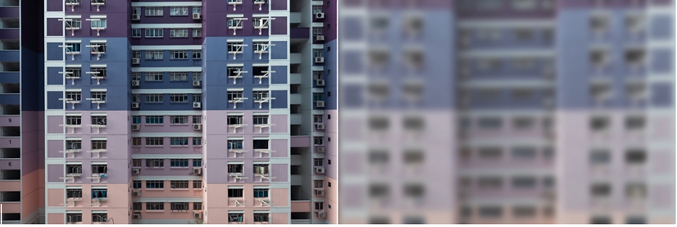

I processed the image in ProCreate as it is far easier to use than Photoshop. I decreased the opacity so the text overlay would be clear against the image then and added Gaussian blur. I used the American Typewriter font as it is evocative of a time when typewriters were thought to be replacements for printing presses.[2]

I created a page acknowledging copyright forNetflix and the assorted books and PlayStation games that could be seen in the living room. I added a “#stayedathome” page, as hashtags are an easily recognisable part of modern social media culture. I was anxious to send the PDF to print, so rather than use the inside front cover for something that was meaningless, I left it blank.
Blurb suggest ordering a single copy for proof-reading purposes. Mixam offer a free proof copy service, with the customer only paying the cost of delivery. There wasn’t time in the schedule to order a proof copy, review it, then order my final copies, as delivery would not have taken place until the end of June, so I submitted the PDF to Blurb that night. The following morning I realised that I should have added an introduction on the inside front cover, but it was too late to recall or cancel the print job as I had already received an acknowledgment email. My normal process when creating any project or undertaking research is to leave the project to ‘sit’ overnight, so that with some distance, I can look at it with a more critical eye and review and edit as necessary. Not taking this review time resulted in a financial and creative cost. Delivery was realised a week later, six days earlier than anticipated, so with hindsight there would have been time to amend the layout and content before sending it to print. Although there was room in myplanner for printing, based on the quote generator for a specific supplier, I had not taken using an alternative supplier and their timetable into account. In the future I would be clear on printing and delivery times across a number of providers and factor that into my proposal.
My final layout was as follows:
Page 1: outside front cover with image of an apartment block
Page 2: inside front cover -> blank
Pages 3 - 33: images
Page 34: #stayedathome
Page 35: inside back cover -> copyright information
Page 36: outside back cover -> image of an apartment block
This was the version that was sent to print. Because of the changes from my original plan – size, number of pages and paper type – I was only able to order three copies instead of the planned five copies.
From this layout I created the PDF that was used to create the Issuu e-book. After receiving initial feedback about adding an introduction page and artist statement, I used PowerPoint to create a revised PDF, which was uploaded to Issuu: the original version was deleted.
Despite the omissions in the original PDF, receiving the printed copies was very gratifying. The paper stock was better than the choices I had made with Mixam and the overall look and feel was that of a high-end magazine.

Feedback
The feedback regarding the zine was positive. There were specific points that I agreed with that were rectified with version two of the e-book and will be reproduced in version two of the zine, when I make a further order.

The three main points to consider were as follows:
1) Adding an introduction to provide understanding to the audience regarding the project. I had previously thought about this but due to panic regarding ever-changing time constraints, I had overlooked it until after sending the project to print.
2) During the early stages of the project I had initially decided to include the date under each image but then decided against it. My first choice of typeface was Helvetica, but it seemed too simple and somewhat bland for how I wanted the zine to look. The American Typewriter typeface added visual heft which I hoped would add metaphorical heft to the project as a whole.
3) I had not previously thought about adding an artist statement, so this is something I will take on board for the future.
In order not to forget any crucial points, I will create a small checklist of important factors that need to be considered before sending any images to print.
I requested feedback via a questionnaire in order to gain further understanding about the audiences’ connection to the work.
Project Proposal
"Do the images meet the proposal idea? Is there a clear visual narrative? Do the images represent life under the COVID19 pandemic?"

Context and Audience
"How do the images connect with you? Are the images relevant to current life?"

Message and Intent
"Do the photographs provoke or show emotion? Do the photographs demand your attention? How do the photographs make you feel?"

The overwhelming consensus is that the images resonated with the audience: lockdown wasn’t something that was aimed at a particular segment of the community, but of everyone, worldwide. Whilst individuals and households had their own coping methods for dealing with an unprecedented situation, everyone could identify with the isolation and stilted existence that became a daily reality.
My first choice for my FMP had been to explore the Japanese concept of wabi-sabi, the idea that there is beauty in imperfect, impermanent and incomplete objects and situations. Though this is a concept I would still like to explore in the future, creating a set of images that connects with an immediate and wider audience has been gratifying and has provided some insight into how ordinary individuals have reacted to intense feelings of isolation.


Comments