Workshop: Colour Theory
- elle walker

- Jan 18, 2019
- 4 min read
Updated: Mar 25, 2019
What is colour theory?
Colour theory is the practice of analysing colour and light and their properties in order to create either 'discord or harmony'* in the image making process. By understanding where each colour lives on the colour wheel and its relation to the other colours around it, the creator can use colour to enhance their story.
There are two colour wheels: artist's and RGB.
1) Artist's. The primary colours of red, yellow and blue cannot be made from mixing any other colours together.
2) RGB. All digital colours can be derived from mixing red, green and blue together in a variety of combinations. For the purposes of this workshop, the RGB colour wheel is the one under discussion.
Primary colours
Red, green and blue
Secondary colours
Yellow, cyan and magenta are made by mixing equal parts of the primary colours next to it.
Tertiary colours
Are sited between the primary colours and created by mixing adjacent colours.
There is a naming convention whereby the colours are named simply after the colours used to create it, e.g., a red and yellow mixture is called red-yellow. The only exception to this orange, which is called, well, orange. Weird.
Complimentary colours
The two colours opposite each other on the colour wheel can have great impact in an image if used sparingly.

Analogous
Colours adjacent to each other, e.g. green and blue.

Triadic scheme
Three equally spaced colours, e.g, the primary colours of red, green and blue.

Tetradic scheme
Two sets of complimentary colours, e.g.red-blue and indigo-yellow create a striking image.

Split complimentary
A dominant colour plus colours analogous to the complimentary colour creates both punch from the dominant colour and harmony from the analogous colours e.g. yellow (dominant) and purple and blue (harmonious analogous colours).

Colour harmony
Harmony can be created by utilising a single or monochromatic hue: imagine an all red scene, maybe ripe tomatoes, strawberries and red peppers in a photograph depicting the benefits of fresh fruit and vegetables in your diet. This could create a very powerful, punchy image.


Task
Shoot still life photography, paying attention to the colour: monochromatic, complimentary, analogous, split complimentary or triadic.
Tools
Canon 70D
Bowens Esprit GM750+
Softbox
Lightroom
Photoshop
Complimentary
I had decided to shoot complimentary colours, in this case, a purple and yellow. My first object of choice was an empty perfume bottle, a deep rich purple, which would be shot against a yellow backdrop.
Black Opium, by Yves Saint Laurent
ISO 200
29 mm
f/11
0.3 sec
(I’m taking a moment to inhale the gorgeous aroma of this perfume, which is up in my top five of awesome smells, along with bacon, coffee, freshly baked bread and fresh laundry.)
Okay, back to business.


A few refinements were done via Lightroom, to include straightening the image, increasing the exposure a little and reducing the contrast to enable the texture of the bottle to be visible. Finally, the heal tool was used to remove the reflection from the bottle.
Once the first shots had been taken and the images reviewed on the computer - shooting tethered - the I-swore-blind-it-was-purple bottle was actually black, so I moved on to Plan B, which was to choose monochromatic colours.
Monochrome
ISO 200
29 mm
f/11
0.3 sec
Lemons are also in my top six (I forgot how much I love lemons) of aromas so I was more than happy to spend some time photographing them.
The lemons were sprayed with a water and glycerine solution which makes the fruit look tantalisingly fresh and succulent. Minor blemishes were removed using the patch tool in Photoshop.


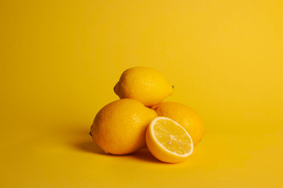


Tethered shooting is a really efficient method of capturing still lives/products, due to the ability to see the image immediately after pressing the shutter release button and making any necessary adjustments to the settings and/or composition. For these images the shutter release was fired through the on-screen option to avoid any risk of camera shake.
This was a really enjoyable process, limited only by the amount of time available in the studio. It's easy to lose track of time and spend far too long on producing one image, so time has to be efficiently managed and to that end, a comprehensive shot plan should be drawn up. I was mindful that there were eleven other people who need their time in the studio as well, so took it as an opportunity to explore one colour theme instead of attempting to cover as many colour families as possible.
Sunshine-y yellow inspiration can be seen here https://www.pinterest.co.uk/michwalk/yellow/

Though it's not on the colour wheel, having a total absence of any colour, I was curious to see the effect of white when converted to a black and white image.
The picture above is simple: a white object shot on a white background, with a mirror for maximum whiteness.
The picture below was converted to black and white, the contrast at its lowest possible setting, with the highlights and white pumped to the maximum level where the image was still viewable.

The colour image has a degree of warmth compared to the black and white image, which is quite stark and crisp. Overall I prefer the colour version, as it is more naturalistic than its highly processed cousin.
I'll be undertaking more still life/products in the coming weeks so I'll have the opportunity to explore colour even further.

References
Baker, J. (2011). The Art of Choosing: Triadic Color Schemes. [online] Flickr. Available at: https://www.flickr.com/photos/jenib/6518243741 [Accessed 18 Jan. 2019].
Graf1x.com. (2019). Color Wheel Poster – graf1x.com. [online] Available at: https://graf1x.com/product/color-wheel-pdf-for-printing/ [Accessed 18 Jan. 2019].
*Malpas, P. (2006). Capturing Colour. 1st ed. Lausanne: AVA Academia, pp.12-23.
Photographymad.com. (2019). What is Colour Temperature? | Photography Mad. [online] Available at: https://www.photographymad.com/pages/view/what-is-colour-temperature [Accessed 1 Mar. 2019].
Przybyla, D. (2019). Analogous Colors: Definition, Examples and Schemes - Color Psychology. [online] Color Psychology. Available at: https://www.colorpsychology.org/analogous-colors/ [Accessed 15 Mar. 2019].


Comments